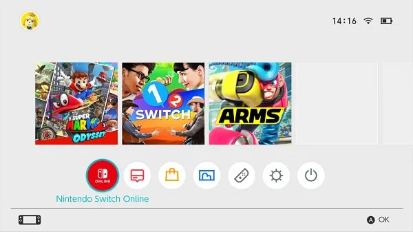
Despite being sold to and loved by millions of consumers, the Nintendo Switch has almost always received a little flack for its relatively boring system UI. That’s what makes this latest revelation from Twitter user “@PaulFelixKelly” so enchanting, as things could’ve almost been a little different.
As shown off in a series of recently released leaked screenshots, the Switch UI we’ve grown used to for the last seven years looked a little different in its earlier days.
Painting a different picture
As pointed out by Nintendo Everything, the findings from @PaulFelixKelly show four screenshots of the early Switch UI in a thread on X. These were apparently discovered on the flash memory of a prototype Switch unit:
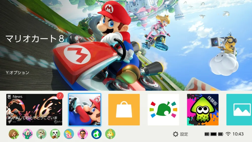
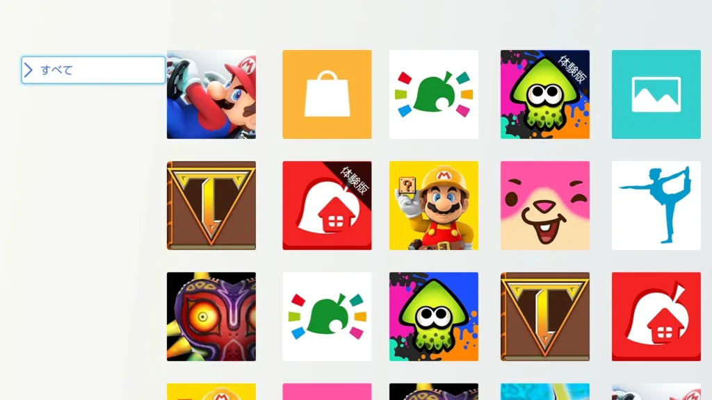
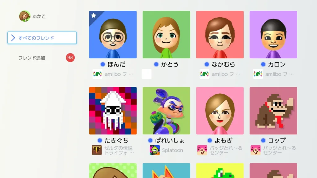
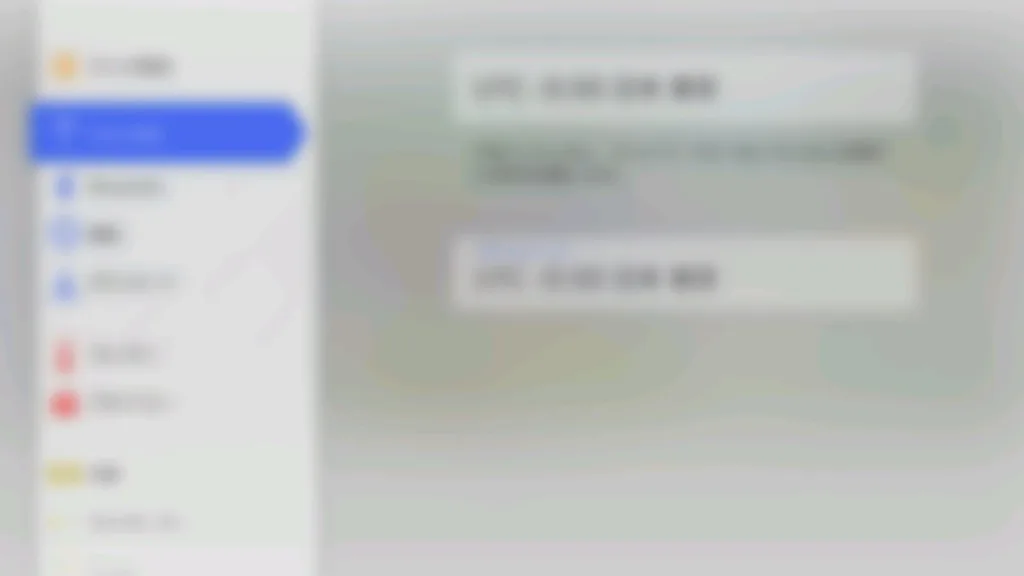
All of the game/app icons used in these images are old art from the Wii U/3DS era, adding a little bit of legitimacy to the notion that these are indeed screenshots of the early Switch UI.
Nevertheless, assuming this is indeed how it used to look, whether or not it’s superior to the actual design we ended up actually getting is purely subjective.
One thing is for certain, the concept of focusing on flat, tile-like menu icons and an overall squared layout was clearly already decided upon at this point.
This is quite a different design language compared to the glossy, rounded look of the preceding Wii U Home Menu that sported elements such as glass and heavy transparency effects; a product of the time.
On that note, the move to the flatter, more basic look of both this prototype Switch UI and the release design is also indicative of a shift in design trends:
The mid-2000s to mid-2010s were filled with what’s known as skeuomorphism, featuring design elements such as rounded menu icons, frequent use of drop shadows, and logos that sported a lot of depth and complex designs.
From the mid-2010s until now, companies far and wide have gone in the exact opposite direction, with the trends now being “simple,” “clean,” and “to the point” — hence the abundance of incredibly flat, boxy logos and UI designs across the board that we see today.
Nintendo isn’t known for following the crowd too much, but it absolutely decided to reflect the current time period with the design of the Switch’s UI, for better or worse.
Check out more content:
GameShark hints at Nintendo Switch 2 September release date | Ubisoft wants gamers to get used to subscriptions | Hyperkin reveals modernised Xbox S controller